
How to make waterfall and timeline graphs in Looker Studio?
We couldn’t think of a dryer title, so we’ll stick to it for the description: Waterfall and Timeline in Looker Studio!
At this stage, we assume that you’re somewhat familiar with Looker Studio. You’ve become proficient in building dashboards and adding tables, bar charts, line charts, time series, … You work on a daily basis with controls, date range, and can even blend data sources to display exactly what you need. But what if Looker Studio was versatile enough so you could use it for even more projects, like showing PnL or managing schedules? This is why, in this article, we will show you how to build waterfall and timeline graphs in Looker Studio. Less marketing-oriented content as we’re used to, but can still be pretty useful. Food for thought let’s say. We hope you’ll like it :)
Top Looker Studio connectors we love and use on a daily basis (all with free trials): PMA - Windsor - Supermetrics - Catchr - Funnel - Dataslayer. Reviews here and there.
Not sure which one to pick? Have a question? Need a pro to get a project done? Contact us on LinkedIn or by e-mail, and we’ll clear up any doubt you might have.
Looking for Looker Studio courses? We don’t have any… but you can check Udemy!
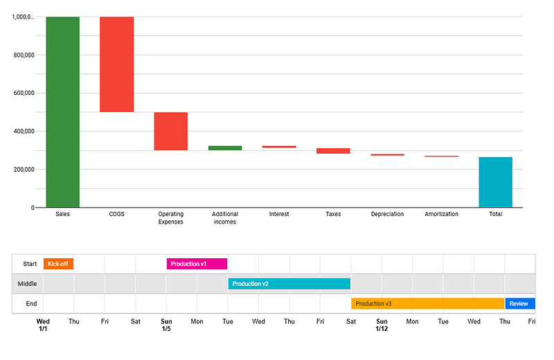
Create a waterfall to make a PnL visually appealing
These are pretty straight-forward, once your data is coming in the right format and you know how to sort it!
In your Looker Studio report, please add a chart, and select Waterfall. You’ll only need one dimension (that stores the categories you’ll be looking into) and one metric (the value that will be displayed), and that’s pretty much it. Add a date range dimension so you can play a bit with your waterfall, and you’re good to go, right?
Wait a second, there are a few pitfalls here we need to debunk:
As usual, you can both drill down dimensions and use optional metrics, which can be useful when you want to be able to share info without repeating 10 times the same graph
You need to have a sorting field so your dimensions are, well, sorted the way you want ^^ This will either require a field in your data source, that your dimension values are coded like 1. Sales 2. COGS …, OR that you create a custom field along the lines of:
AVG(
CASE
WHEN Dimension='Sales' THEN 1
WHEN Dimension='COGS' THEN 2
WHEN Dimension='Operating Expenses' THEN 3
...
END
)
Similarly, based on how your data is stored, you might need to create a new field to manage pluses and minuses (we’ve seen data sources where all values are positive, with another field giving you the sign for instance)
Don’t forget to add a Total at the end in Setup. Total that you can color differently from positive and negative bars (under the Style ribbon)
Now, the main caveat (as of today): you cannot display value on the graph. Yes, they’ll show on hover, but not directly, a bit annoying in all fairness, we hope Google will fix that soon!
And that’s pretty much it for waterfall. Powerful, still a bit limited by the lack of labelling, but we’re getting there slowly but surely. Now, we’re sure there are many instances where you could use such a dataviz to generate insights and make strong statements like: “We pay way too much taxes” ^^
Create a timeline to manage a schedule
This one is quite nice for project management, and remove the need for yet another paid tool to work with.
In your Looker Studio report, please add a chart, and this time select Timeline. As always, pick the field for the date range, and now things become a bit more complex (not that much either):
Pick your category name as your row label AND your step name as the bar label: makes the reading easier in our own opinion as two steps can be on the same line (not mandatory thought, you could go straight to step level and therefore each step is on a different line by disabling Group by row label tick)
Pick start time and end time OR start time and duration (in days)
Again, build a calculated field for your sorting (or set naming conventions in your data sources), and that’s it, you should have a nice timeline to play with
Pitfalls here:
Events that last 0 days (same start & end dates or duration=0) won’t show. Minimum is therefore 1 day, yes ma’am
You can color all items on a given line with the same color (under Style, pick Color by bar label), or differently (pick Color by row label)
You can add tooltips, so when people hover their mouse on a bar, they’ll be able to read whatever you want them to know (very kind of you!)
And that’s pretty much it for today! Not very difficult, but not very used either from experience. So next time you need to build a report, think about these dataviz, they sometimes can tell a story better than a table, whilst saving a few bucks on other time-management tools :)
PROBLEM SOLVED
Top Looker Studio connectors we love and use on a daily basis (all with free trials): PMA - Windsor - Supermetrics - Catchr - Funnel - Dataslayer. Reviews here and there.
Not sure which one to pick? Have a question? Need a pro to get a project done? Contact us on LinkedIn or by e-mail, and we’ll clear up any doubt you might have.
Looking for Looker Studio courses? We don’t have any… but you can check Udemy!
Communicate and browse privately. Check Proton Mail and Proton VPN
Website hosted by Tropical Server