How to build good looking gauges with Looker Studio?
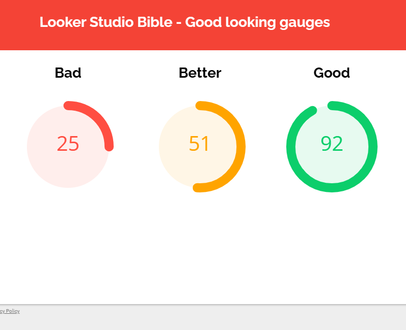
Here’s a nice community visualization for Looker Studio: the good looking gauge. Check it out, it’ll make your reports look great !
This is one of our favorite dataviz. The gauge. DA Gauge, yes ma’am ^^ An easy way to monitor if everything’s ok, in a blink of an eye. In this article, we’ll show you how to build good looking gauges in Looker Studio. Yes, it has to do with Community Visualization.
Top Looker Studio connectors we love and use on a daily basis (all with free trials): PMA - Windsor - Supermetrics - Catchr - Funnel - Dataslayer. Reviews here and there.
Not sure which one to pick? Have a question? Need a pro to get a project done? Contact us on LinkedIn or by e-mail, and we’ll clear up any doubt you might have.
Looking for Looker Studio courses? We don’t have any… but you can check Udemy!
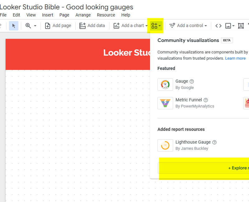
Explore community visualizations and add the lighthouse gauge by James Buckley
In the ribbon at the top of your screen, between Add a chart and Add a control, please click on the 4 icons to open the Community Visualizations menu.
What are these? They are dataviz not developped directly by Google own product team, but by other companies, to offer you a wider range of data visualizations. Today, we’ll focus on the lighthouse gauge by James Buckley, but don’t hesitate to check out this section from time to time to see if you can find something interesting for your reports.
Set-up is usually a bit harder than regular dataviz (so don’t hesitate to refer to documentation), but they can be very powerful as well.
So, at the bottom of the menu, click on Explore more, scroll down, and add the lighthouse gauge by James Buckley. You’ll need to grant it access so it can render your data (it will render data but does not have access to it). If you want to learn more about security aspect, you can learn more here.
Set-up the dataviz
Now, we’re going to set-up the dataviz. Click on the arrow top right of the dataviz to open the usual Setup/ Style ribbons.
In the setup ribbon, once you’ve picked your source:
Date Range Dimension: self-explanatory
Gauge value: your metric
Gauge ranges — Minimum and Maximum value:
Here you can set-up dynamic minimum/maximum. It can be another metric from your data, or even a calculation. If it’s a fixed number, leave this empty, we’ll do it later in the Style ribbon
But beware, if your metric value is lower than minimum or higher than maximum, it’ll show the gauges totally empty or totally full
Gauge ranges — low, mid and high ranges:
Does your color coding depend on a metric or a calculation? If so, this is where you’ll set it up
Let’s say your metric should be in the low range (the one we’ll color red) if it’s lower than another metric by 50% — 25%. So, the low range start should be: Other metric * 0.5. And low range end should be: Other metric * 0.75.
In case your ranges are fixed, again you can leave these fields empty and move on to the Style ribbon
We’re almost there! In the Style ribbon, in case you’ve left min/max and low mid high ranges metrics empty, you can set the minimum, the maximum, and then for each range, define a start, and end, the color of the border and the color of the interior of the gauge.
There are a few additional options like Fill Gauge Centre / Outer Ring, or not, Progress Anti-clockwise, …, play with them to see how they impact your dataviz.
And that’s it, you’ve got good looking gauges to impress everyone!
In this short article, we’ve reviewed how to build good looking gauges in Looker Studio.
PROBLEM SOLVED !
Top Looker Studio connectors we love and use on a daily basis (all with free trials): PMA - Windsor - Supermetrics - Catchr - Funnel - Dataslayer. Reviews here and there.
Not sure which one to pick? Have a question? Need a pro to get a project done? Contact us on LinkedIn or by e-mail, and we’ll clear up any doubt you might have.
Looking for Looker Studio courses? We don’t have any… but you can check Udemy!
Communicate and browse privately. Check Proton Mail and Proton VPN
Website hosted by Tropical Server


