
How to build a good looking creative reporting in Looker Studio
Want to build good looking dataviz like Motionapp ones, but for free? Here we’ll show you how to replicate in Looker Studio
Motionapp is a very strong tool that allows you to manage your creative performance, generate creative insights, scale iterations faster & learn what to produce next (at least, according to their website ^^). Many of our clients use it on a daily basis. Others don’t, as they don’t need most of their features. But they still like their reporting. So in this article, we’ll show you how to build a good looking creative reporting in Looker Studio. Maybe won’t be as cool due to technical limitations, but we’ll try to get as close as possible!
Top Looker Studio connectors we love and use on a daily basis (all with free trials): PMA - Windsor - Supermetrics - Catchr - Funnel - Dataslayer. Reviews here and there.
Not sure which one to pick? Have a question? Need a pro to get a project done? Contact us on LinkedIn or by e-mail, and we’ll clear up any doubt you might have.
Looking for Looker Studio courses? We don’t have any… but you can check Udemy!
Use the Ad Image URL as your key
First thing first. Let’s say you’ve got a Meta Ads connector already in place (we’ll use one from Supermetrics for this example, but it’d work with any connector really, Catchr, Windsor, Funnel, Power My Analytics…). You should have a metric called Ad Image URL. This is the one we will constantly use, as the same image could be used through different Ads, so if you want to report performances based on the creative, this is the one field to go.
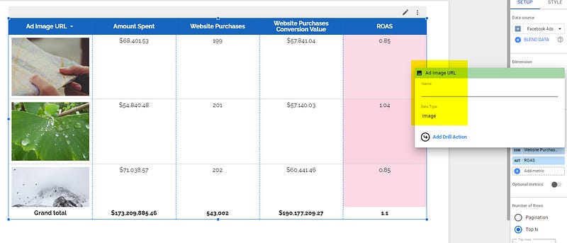
Build your first table using Ad Image URL
In your Looker Studio report, please create a table, add Ad Image URL as a dimension (make sure its format is set to Image), and Amount Spent as a metric along with the ones you usually report on. Add a few heatmaps here and there on your important metrics, play with colors, font and alignment. And voilà, you should see all your creatives in a motionapp-like table:
Build cards using a table… but in vertical!
In Looker Studio, it’s harder, but actually you can build cards like in Motionapp. Here the little hack to so:
Create a regular table, but transpose it by changing it from Vertical to Horizontal
Hide headers
Only select Top X rows (and make sure to sort by Amount Spent descending, website purchases descending, … the metric you want to report on)
Add a few text boxes at the left of your graph to label it
Something we haven’t done would be to play with grids, you can add some if you want
And off you go, with a bit of efforts, you’ve recreated the touch and feel of little card boxes:
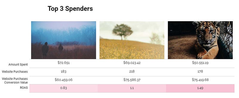
Limitations: you can’t do it on all creatives, so you’ll have to make a choice here, Top 5 Spenders, Top 3 CPA, …. Still, it’s somewhat better than our previous table right?!
Make graphs, using a table as label!
Now, we’re going to create Motionapp-like histogram chart, with the image as the label of the column (something you can’t do natively). To do so:
Add a chart, histogram, put Amount Spent as metric and Ad Image URL as dimension
In Style, pick 5 bars and don’t group Others
Sort by Amount Spent descending
Hide the legend at the bottom by reducing its size to the minimum, drag-dropping with your mouse
Just below the graph, add a table, with the same set-up as previous: Amount Spent by Ad Image URL, Top 5 rows, Vertical, Hide headers, sorted by Amount Spent descending
Make it fit so each image is shown next to its bar
If you followed these steps, you should have something like that:

Not perfect, but still better than what’s currently available in Looker Studio.
And that’s all for today folks. Looker Studio does not offer beautiful dataviz as Motionapp does, but with a few tweaks we still can get close!
PROBLEM SOLVED
Top Looker Studio connectors we love and use on a daily basis (all with free trials): PMA - Windsor - Supermetrics - Catchr - Funnel - Dataslayer. Reviews here and there.
Not sure which one to pick? Have a question? Need a pro to get a project done? Contact us on LinkedIn or by e-mail, and we’ll clear up any doubt you might have.
Looking for Looker Studio courses? We don’t have any… but you can check Udemy!
Communicate and browse privately. Check Proton Mail and Proton VPN
Website hosted by Tropical Server