Yet again another Google Search Console template for Looker Studio… Or is it?!
Looking for a rock solid Looker Studio template for your Google Search Console report? Search no more, we’ve got you covered here :)
The world wide web is full of Google Search Console templates… Nonetheless, we decided to build yet again another Google Search Console template for Looker Studio… Or is it?! Is this one different and offers some extra features that other don’t?
You’ll tell us! So, we’ve done it in less than one hour (you know the drill, took one hour to build, but behind there are years of experience), but our real objective here is to share with you a palette of what can be done with Looker Studio (applicable to any data source in reality) and some best practices when it comes to building an useful dashboard. We’ll talk KPIs, tables, but also blended data, monthly variations, parameters, date range, …
With no further delay, you’ll find the template here.
You can choose your own Search Console data source at the top of the report, and bididi badidi boo, it gets updated with your data, practical right? But if there’s something weird in your report and it don’t look good, who you gonna call?!
Top Looker Studio connectors we love and use on a daily basis (all with free trials): PMA - Windsor - Supermetrics - Catchr - Funnel - Dataslayer. Reviews here and there.
Not sure which one to pick? Have a question? Need a pro to get a project done? Contact us on LinkedIn or by e-mail, and we’ll clear up any doubt you might have.
Looking for Looker Studio courses? We don’t have any… but you can check Udemy!
So, what’s in it?
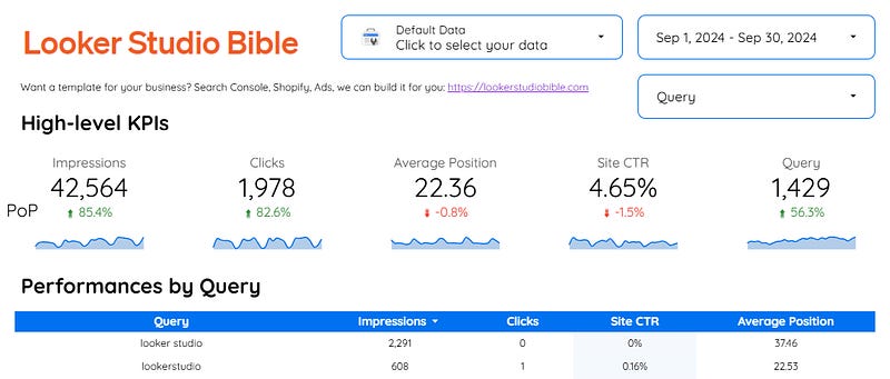
Every good report should start with a strong header, with your logo (that redirects to your website!), and some selectors that are report-level (meaning that they get to appear on every page and that if you make a selection and change page, the selection stays). Quite basic and useful, but we’ve seen many reports where the same controls get repeated uselessly. Then, some page-level controls (in our case, the Query one, ordered by Impressions DESC on this first page).
Just below, the main KPIs you want the user to see when they first land. Only the useful ones (no need for a dozen, ok?). You can add a YoY or a PoP under it (don’t forget to mention if it’s YoY or PoP with a small text box), and a Sparkline by day (totally useless, but it is funny). If you want to go the extra mile, you can have both YoY and PoP by duplicating your KPIs, one YoY, one PoP, and then making the font of one blank so only the % variation is shown.
Moving on to the table: Performances by Query. Most simple, can’t be. You can re-order by clicking on column names, and we’ve added to the Site CTR a little heatmap to help distinguish the best performers. Remember, having one heatmap is cool, but when every metric has an heatmap, it loses its main function: help people spot the outliers.
A blended data with parameters to make strong PoP analysis
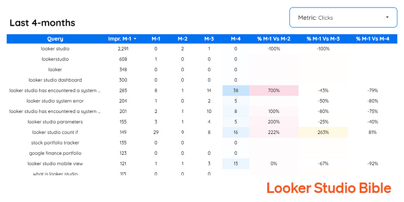
The last 4-months table does not depend on the Date control as we’re using a Custom date range. What have we done here?
We’ve created a new parameter and a new metric to decide which field to show (Impressions, Clicks or CTR)
We’ve blended the GSC data source with itself 3 times to show data for past month plus Month-2, Month-3, Month-4
We’ve kept the impressions last month to ease ranking and focus on top queries/keywords, and added the last 4 months metric performance + % comparison to help identify best performer over the period
And yes, we’ve added 3 heatmaps, exactly the contrary of what we’ve written earlier. If we the first don’t listen what we say… ^^
This table is, for us, where the power of Looker Studio gets unleashed. Playing with parameters offers to users a smooth experience while reducing the need for 3 tables (or 1 table with 20+ metrics in it). Yes, in all fairness we believe we’ve done a good job here!
Page 2 is for fun only, and no, there is no page 3 here ^^
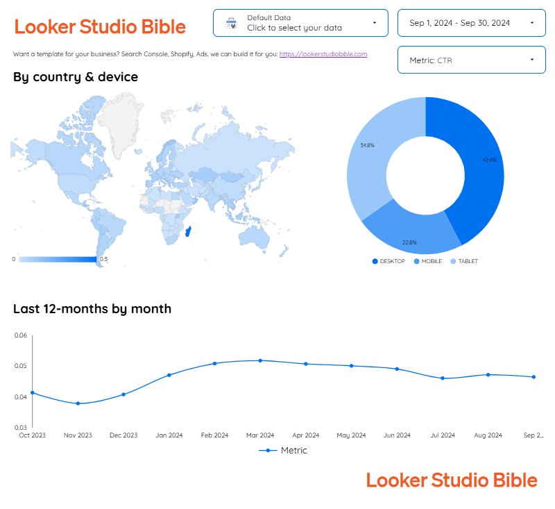
Once you’ve got the main info on Page 1, you can start building Page 2 to have a few additional metrics that frankly most people won’t look at.
Here, we’ve added a Geo chart, a pie chart, and a few smoothed time serie chart to show the last 12 months performances of the selected Metric.
Nothing from outer space, once you know your country/device distribution, it is very unlikely it will change over time.
And that’s if for today folks, hope you’ve enjoyed the reading, that you will use this template for your website or that it gave you some directions to build your own :)
PROBLEM SOLVED
Top Looker Studio connectors we love and use on a daily basis (all with free trials): PMA - Windsor - Supermetrics - Catchr - Funnel - Dataslayer. Reviews here and there.
Not sure which one to pick? Have a question? Need a pro to get a project done? Contact us on LinkedIn or by e-mail, and we’ll clear up any doubt you might have.
Looking for Looker Studio courses? We don’t have any… but you can check Udemy!
Communicate and browse privately. Check Proton Mail and Proton VPN
Website hosted by Tropical Server


